The Page
Rebranding a home renovation app built to empower homeowners.
Background
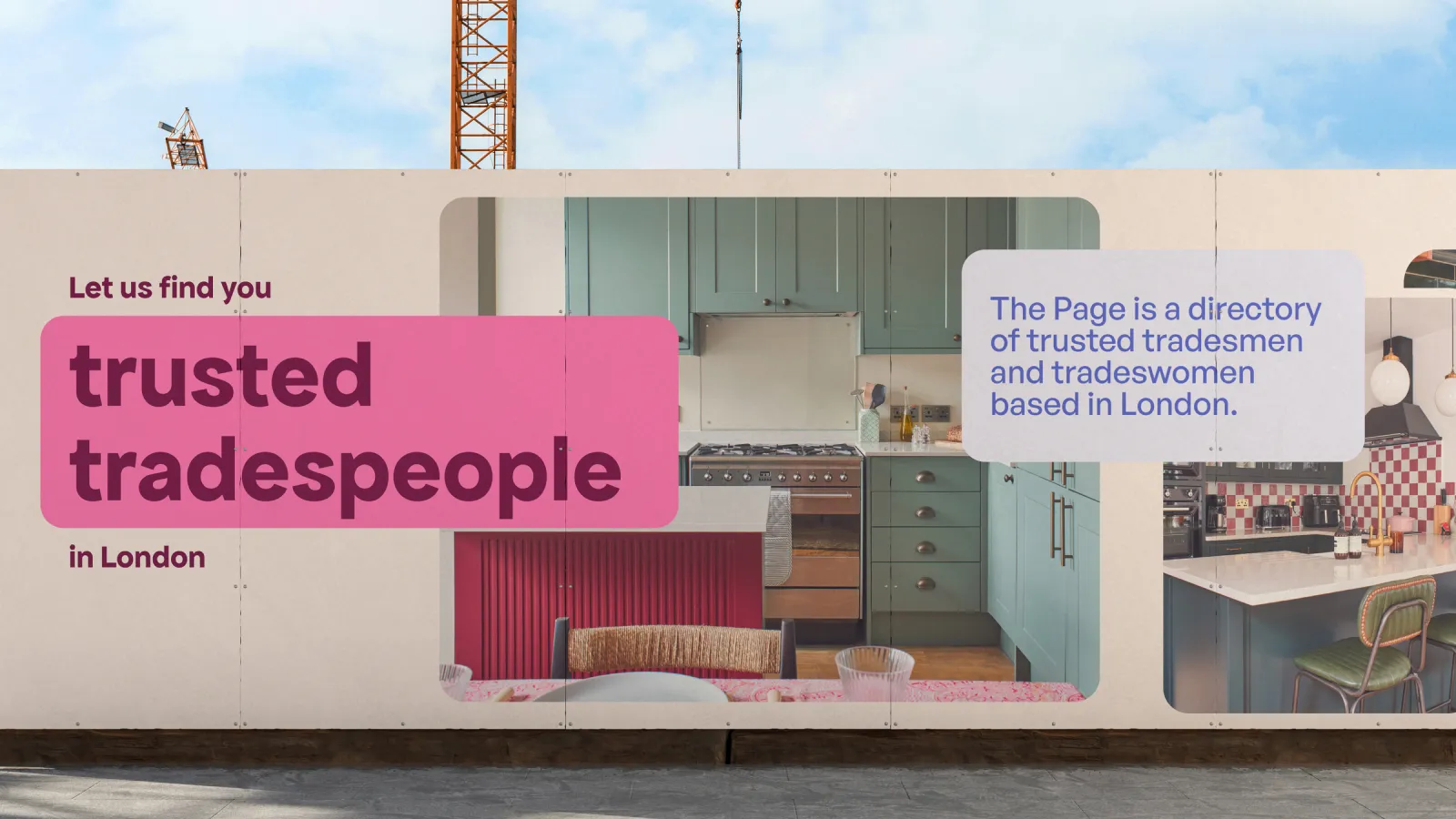
The Page is a platform that helps homeowners find the best builders for their renovation projects. Having previously created a brand for a key competitor, we saw this as a fresh opportunity to challenge ourselves; crafting a brand that would truly stand out in a crowded market. By capturing the founders’ passion and vision, we aimed to inspire confidence in homeowners ready to transform their homes.
Solution
We created a brand designed to motivate and empower homeowners at every stage of their renovation journey. The new identity included a bespoke logotype, refined colour palette, typographic system and a flexible visual language; all consolidated into comprehensive brand guidelines. The result is a confident, characterful brand that brings clarity, energy and trust to an otherwise overwhelming process.

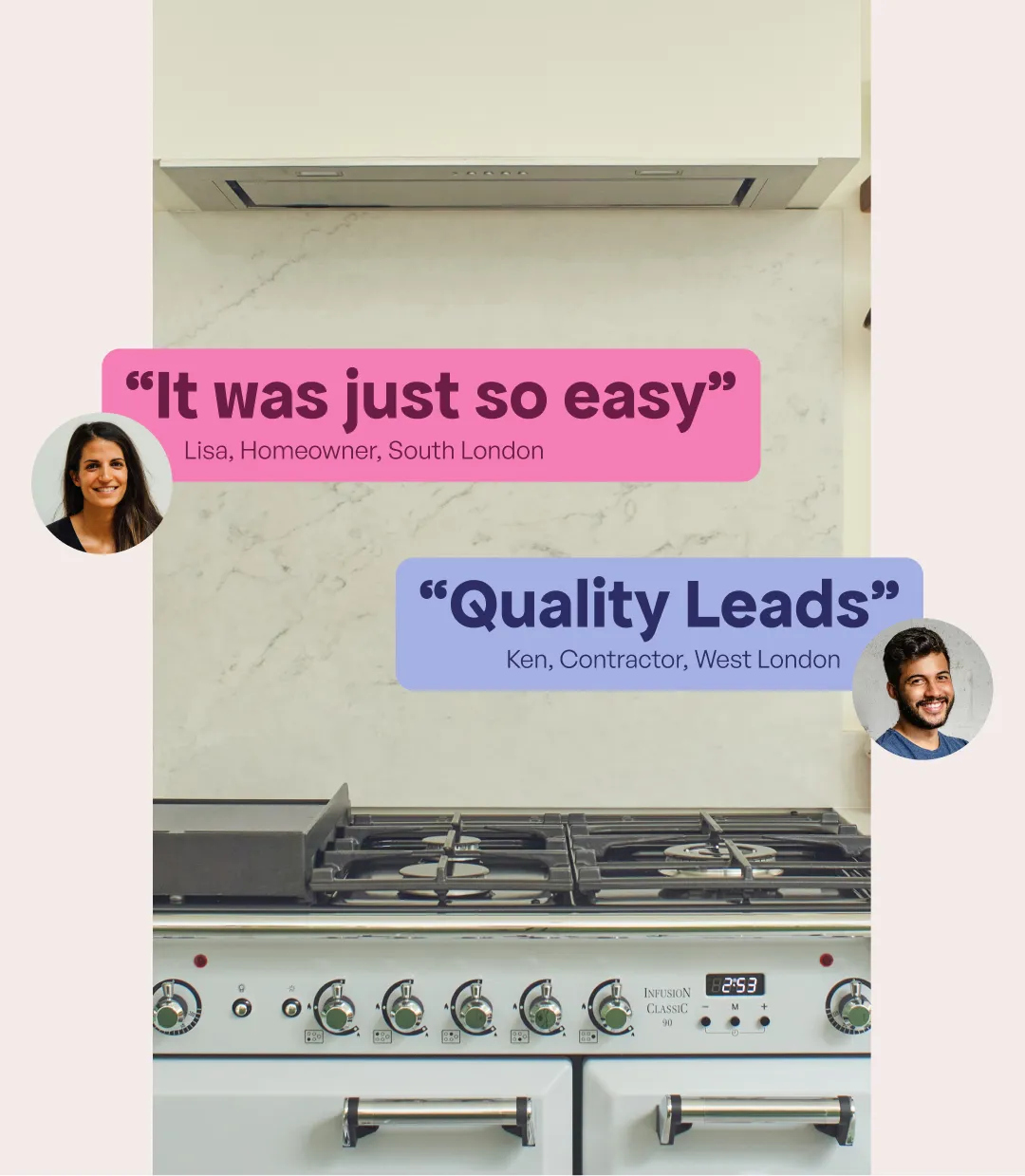


Bringing personality to a category built on caution
We developed a bold and expressive visual language to set The Page apart in a space often dominated by dull, overly cautious design. The bright, confident colour palette and playful illustrations bring warmth and approachability to the brand; helping homeowners feel supported and energised as they navigate renovation decisions. This distinct, characterful identity helps The Page build instant trust while disrupting expectations of what a home renovation brand should look and feel like.